Brand identity for an architecture practice
Halden
Halden is a concept identity for a small architecture practice. The brief: a brand that feels as considered as the buildings — precise, calm and built on a clear structural logic.
- Client
- Concept study
- Role
- Brand strategy, identity design
- Tools
- Figma, Illustrator, AI-assisted exploration
Visual journey


Behind the design
We explored more than forty mark directions in the first two days, then narrowed down to a mark built from the same diagonal geometry as the practice’s floor plans.
- Discover: Define what the practice stands for and how it should feel.
- Explore: Generate and test dozens of directions across marks, grids and type.
- Refine: Turn the chosen direction into a flexible, documented system.
The result
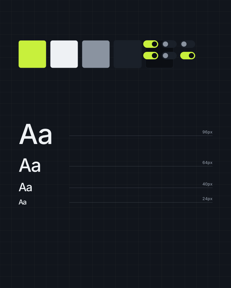
A compact identity system — mark, type, colour and layout rules — that scales from a business card to site hoardings.
Let’s build what’s next
Whether you need a new identity, a full website or a Webflow team on call — tell us what you’re working on and we’ll come back with a plan.
Start a project